Branding Guide
Fonts

General use font, often used in promotional items when a clean basic font is needed. Represents the 'CHURCH' in our logo
Steve's Favorite. Typically used on sermon slides and for titles. Secondary to Montserrat as a main font choice depending on context. Used heavily in social media for large size of text and boxy fit for square images.

Used within booklets for headers and sometimes on a banner in bold

Used for class titles. 'New Life' and 'Orientation' graphics. Title font typically.

Filler text on sermon handouts. Descriptive text for classes and info on banners.

Only looks good with lower case letters, capitals are weird. Spacing is always an issue and needs to be watched and adjusted often. Used for handwritten look but not as often anymore.

Used for 'The Orchard' in logo, but basically nowhere else. Logo has an arch given to the text to improve appeal.

Sometimes used in fill-ins on screen, a good alternative to austtin if capital letters are required
Colors
Orchard Purple
Main Color For EVERYTHING Orchard. Keystone Color.
RGB(84, 44, 112) CMYK (81,98,24,11)
Class Blue
New Life and Orientation utilize this shade most often
RGB(0, 175, 223) CMYK (72,10,4,0)
Orchard Grey
Secondary text color, flexible in shading depending on context
RGB(128, 128, 128) CMYK (52,43,43,8)
Kidz Zone Orange
Everything Kidz Zone uses this as the base shade
RGB(241, 86, 37) CMYK (0,82,98,0)
Logo
Our main logo is useable in all white, or a mix of white or grey and purple. Our files show an all black or all grey option as well but we do not typically utilize them
Useable as it's own piece in creating other graphics or placing with website link. The colored circle has negative space on the inside, the inverse image is not consistent with our branding and the design should not be altered in any way.

Two different versions exist depending on use, either are acceptable. This is for use when we are creating or promoting an event outside of our walls that is for the community. This logo is typically all white or purple, not mixed.
Aesthetic
Class booklets are clean and minimalistic, bright bold clean colors and 1-2 fonts. Imagery is minimal.
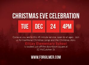
Any handouts are sized differently but maintain the basic information. Front is event name and website, back is more detailed with summary of event, sometimes a map, and the exact dates and info to sign up if needed.
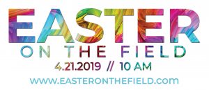
Banners are simple and bold with the website being the focus for all information. Event name and date(s) are only other info typically.